The marketing strategies of luxury furniture brands have had to evolve rapidly to account for the new advertising channels created by social media. But how can such high-end products be promoted and brought to life through these channels? This article answers these questions by analyzing the marketing strategies of 15 luxury furniture brands.
Perigold
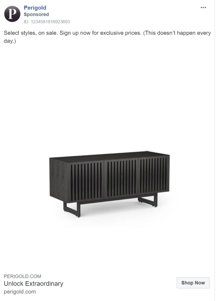
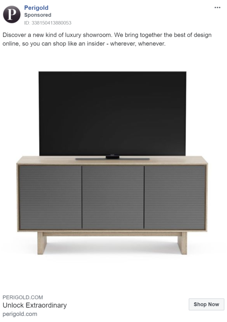
Peigold utilizes simple, minimalist images to sell their products. By omitting all else from their ads, they focus your attention. When teamed with messaging that offers exclusive prices, these make compelling ads.
One downside of online marketplaces is the limited product interaction consumers have prior to purchasing. Perigold uses its captions to address this and celebrate the positives – easy access to designer products!
Vinterior
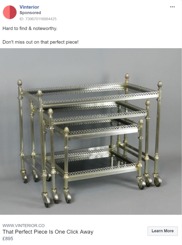
Vinterior uses grey backgrounds to bring pieces to life. No matter how ordinary a product, by stripping the colour from the entire background and leaving only grey, the item couldn’t fail to stand out. Their minimalist arrangements further ensure that all your attention is drawn to the product in question.
Messaging suggesting that their products are rare adds a sense of scarcity and urgency, further provoking action. A short but effective post.
The Cotwolds Company
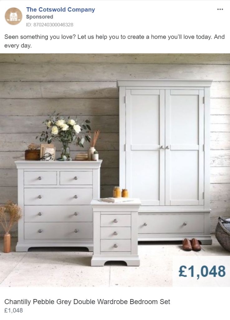
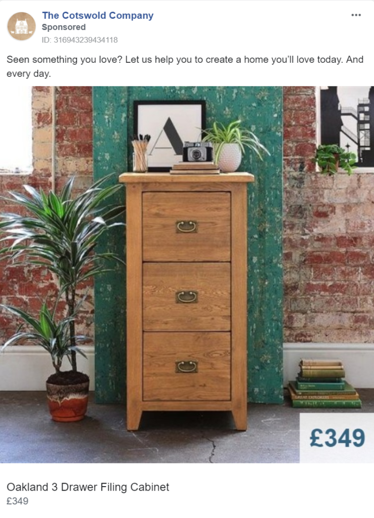
The Cotwolds Company uses beautiful imagery with stark contrasts to attract its audience. In the images below you can see how the products catch the eye through clear contrasts in size or colour. Each wardrobe in the initial image demands attention and your eyes pass from one to another and back again. In the second image, the beautiful contrast of colours effectively draws your attention to its centerpiece.
The notion of their products enabling you to create a home suggests that customers are buying much more than just a product. They’re buying all the comfort that a home provides. This strong messaging, featuring emotive words like ‘love’, compliment the images and make the whole ad more convincing.
MADE.com
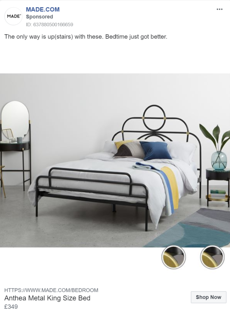
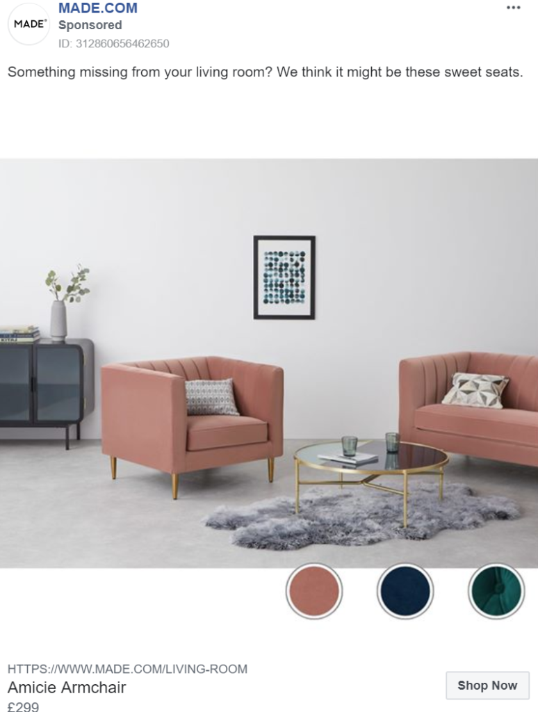
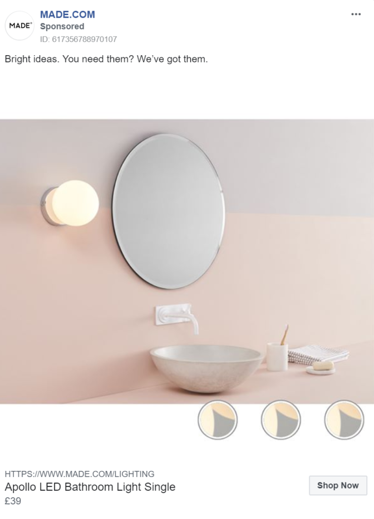
MADE.com perfectly team a variety of products in their ads, allowing them to cross-sell several pieces instead of solely promoting one item. By doing this they not only increase the potential return on ad spend, but they also make their products look more appealing.
The images below look welcoming and lived-in, selling an atmosphere as opposed to just a product. Their use of beautiful imagery makes their products truly hard to resist.
With a modern, fun tone of voice, the messaging succeeds in conveying the brand’s personality. A priority in Made.com’s advertising strategy.
Jansen Furniture
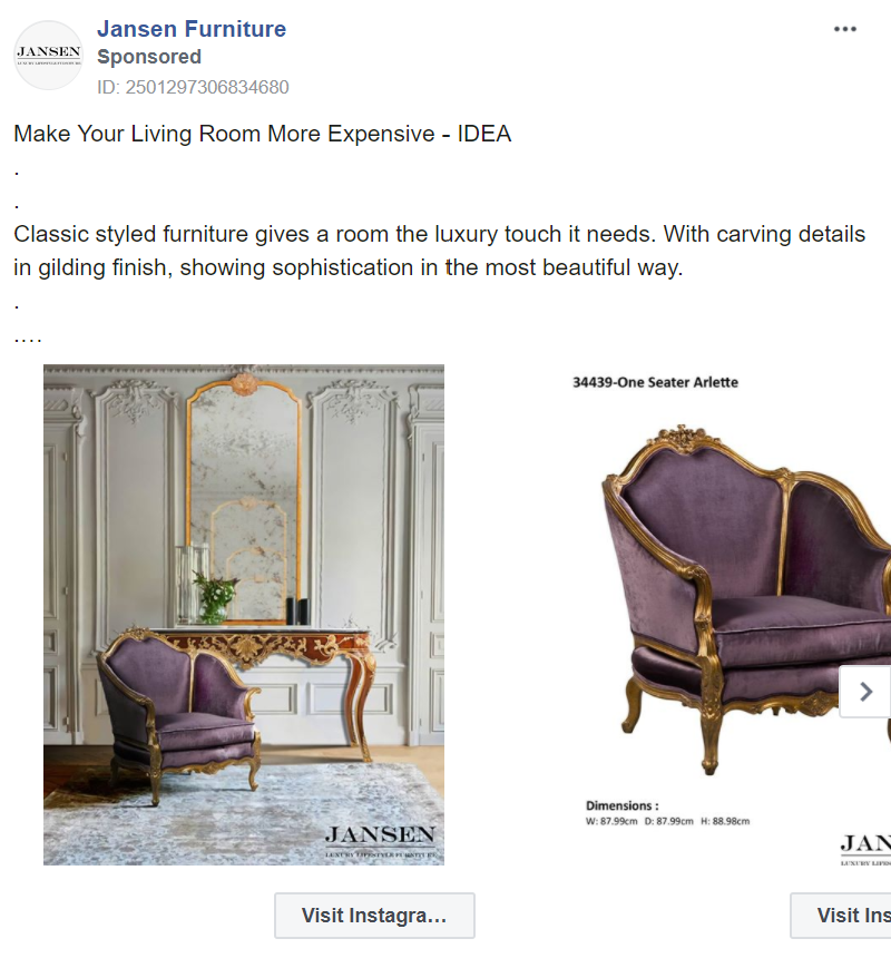
Like Made.com, Jansen furniture sells a “look”. Why have a piece of furniture when you can have a full, beautiful living room? Rather than choosing between displaying an image of a full room and individual product images, they use the image carousel available to utilize both techniques.
They first show the full room with numerous pieces, then they deconstruct it, showing each item individually. In doing this they are able to sell the lifestyle associated with having the products together, but also focus your attention on each item and provide direct links to where each is sold.
Bombinate
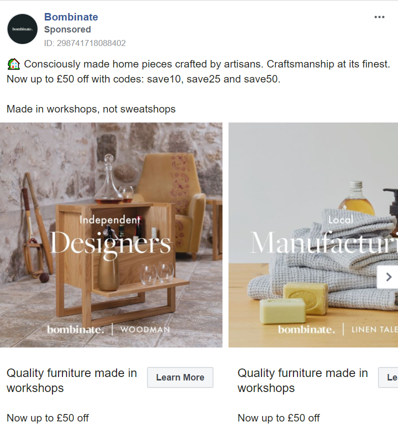
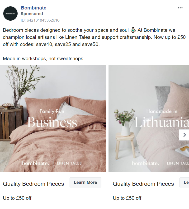
Bombinate uses the carousel feature to highlight its various selling points. From being a family-run business to using independent designers and local manufacturing, the carousel allows them to use a variety of messaging in one ad. These messages promote the craftsmanship that goes into each product, boosting its perceived authenticity, originality and (most importantly) its value.
Their use of carousels and videos separate their ads from competitors, grabbing attention as their target audience scroll through social channels.
Natuzzi
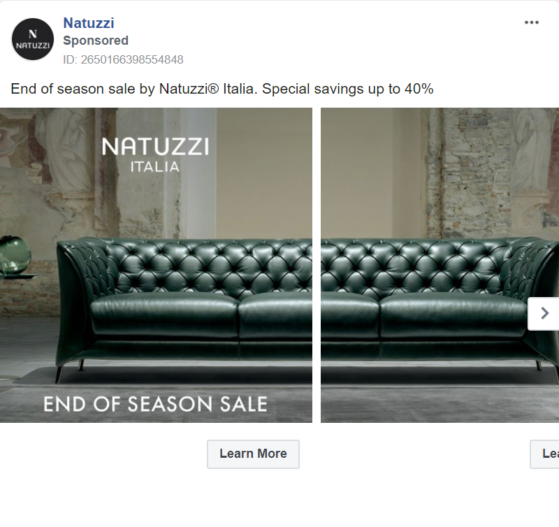
Natuzzi makes its carousel even more eye-catching with this unconventional broken image layout. The sense of it being one long image on a reel compels you to click the arrow to see what’s next. Once you’ve interacted with the ad once, it becomes more likely that you’ll interact with it again and follow its links to the website.
The contrast of the immaculate sofa in the bare brick room makes the ad exceptionally striking.
Hermès
Hermès have opted to grab attention with a beautiful but bizarre video showing a chair being placed upside down on a horse. While offering no information about the product, the video is bound to stand out. A risky technique but one most likely to turn heads. Just make sure it’s for the right reasons!

One Kings Lane
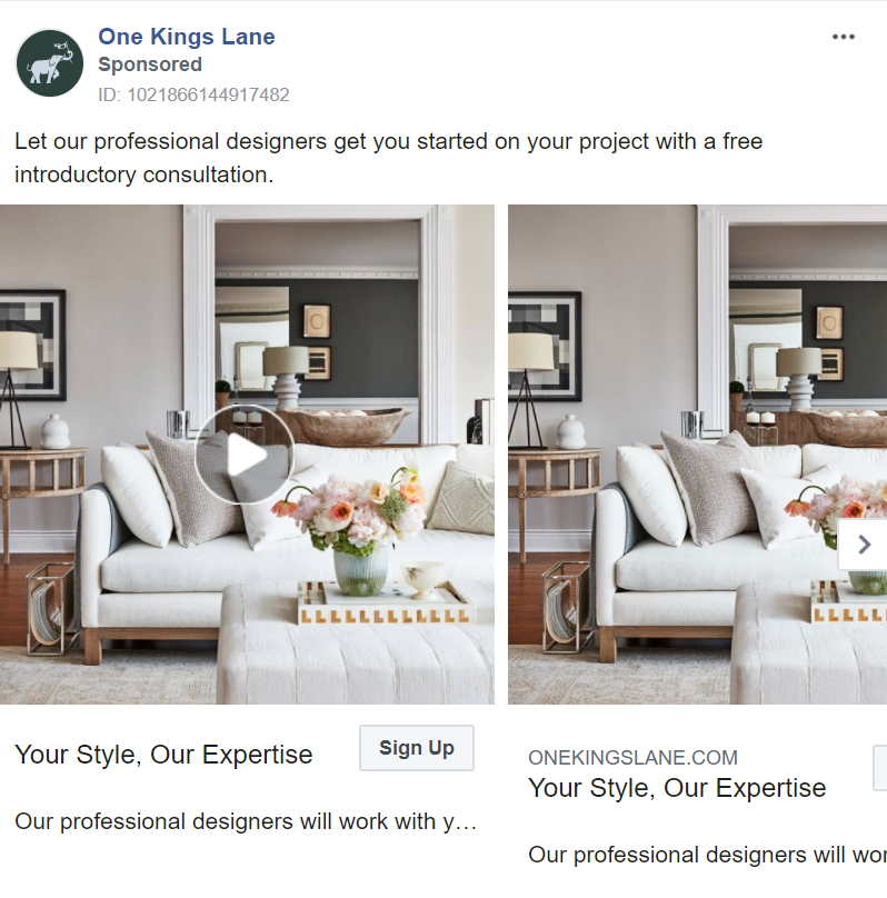
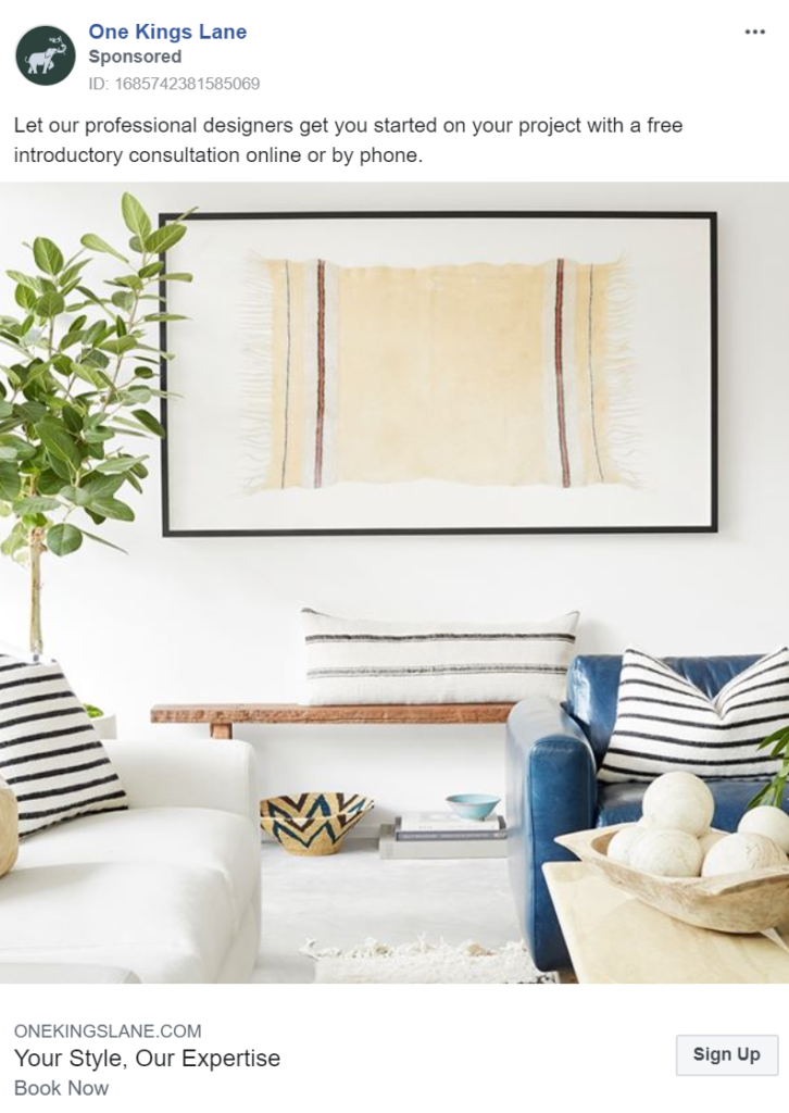
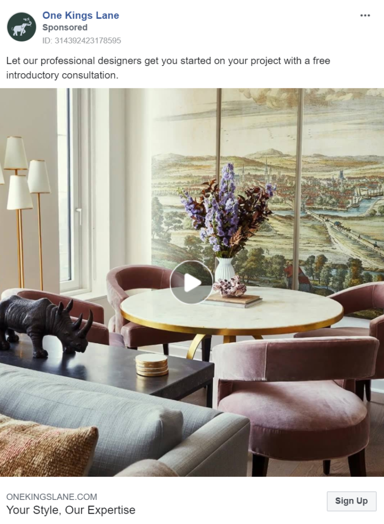
One Kings Lane’s advertising campaign uses all three mediums (images, carousels and videos) to display its products to customers, giving them a greater chance at separating themselves from competitors.
They take a different approach to selling. Instead of promoting their products, they offer a designer consultation. This tactic targets those with higher budgets and provides their staff members with the opportunity to upsell and cross-sell products.
Its messaging promotes its staff as professionals, justifying its high-end price tag. While offering the consultation for free removes any financial barriers in trialling the company.
Neiman Marcus
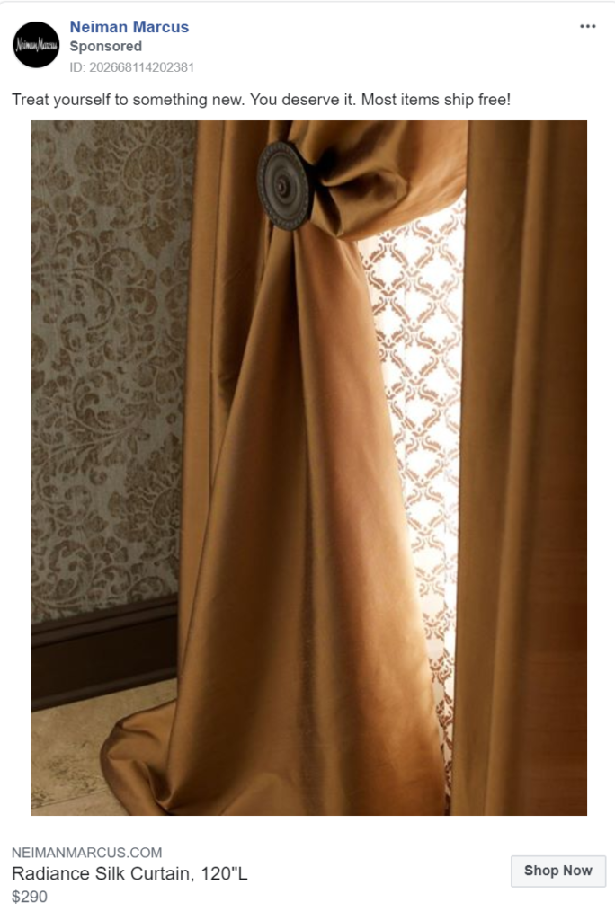
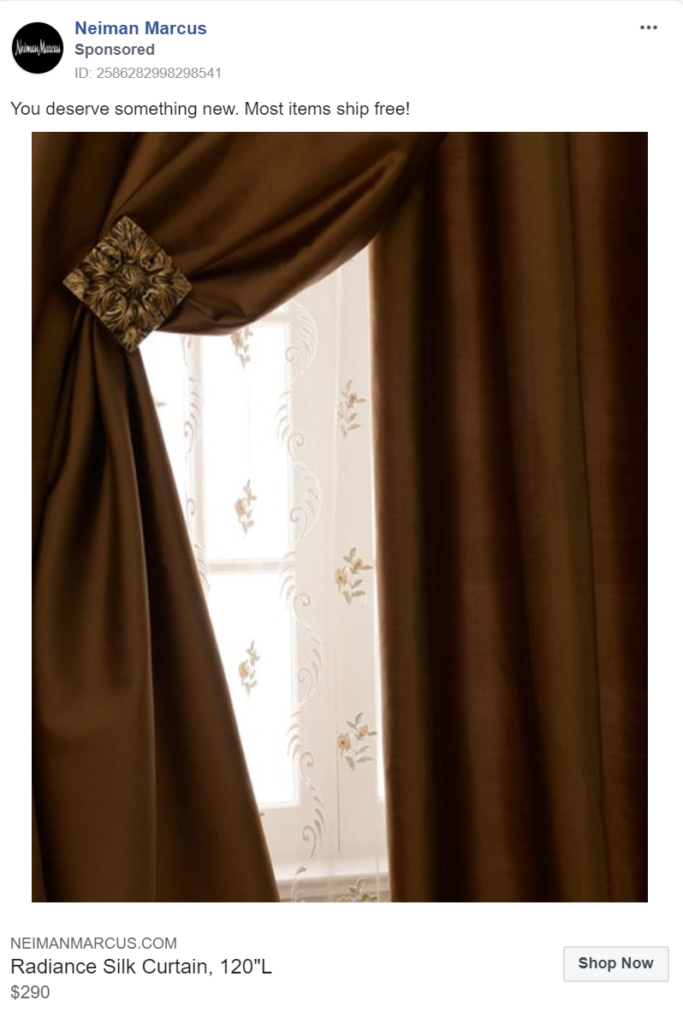
Neiman Marcus focuses on messaging to make a sale. They begin by generating a motive for a purchase, ‘you deserve something new’. This statement alone helps to justify a luxury purchase. When teamed with the removal of a financial barrier (ship for free), people are much more likely to follow the link to their website where their web strategy can seal the deal.
Article
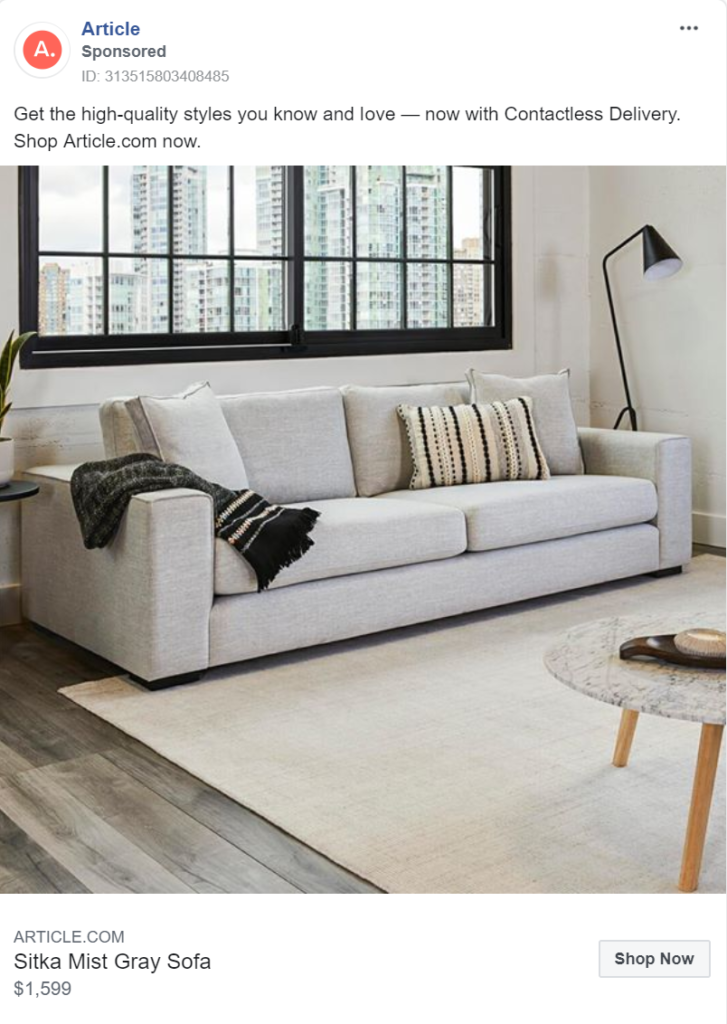
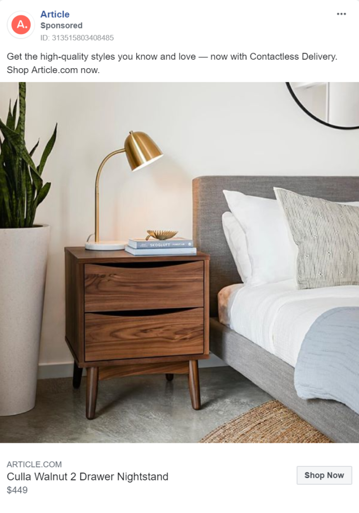
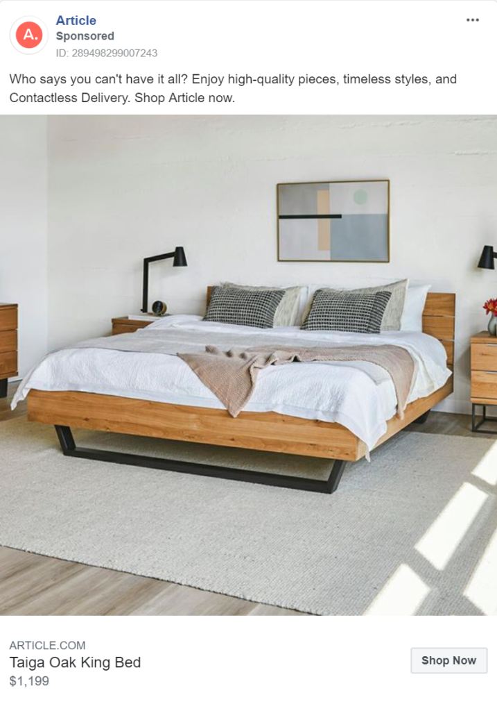
Here Article set their furniture up in such a way that the room looks lived-in. They’ve turned lamps on near books and have ruffled blankets on their sofa and bed. By doing this they’re inviting you to picture yourself living there, surrounded by their products.
Their use of neutral tones may not make their images jump out as much as other ads we’ve mentioned, but it does generate a sense of peace and harmony that makes their rooms look so welcoming.
Finally, their messaging addresses one of the more recent barriers to purchase – Covid-19. As a result of the virus, many people are concerned about having strangers in their home and some governments forbid it. With most large furniture items needing to be delivered, the worry of delivery men bringing disease into people’s homes is a concern for many. Article expertly addresses this concern by offering contactless delivery.
Ethan Allen
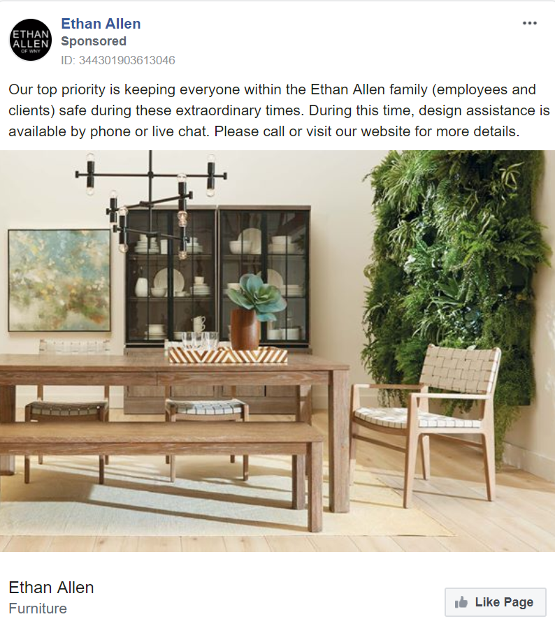
In a similar fashion, Ethan Allen have addressed issues arising as a result of Covid-19 by offering design assistance over the phone and the internet. While acting as a practical solution to the situation, this message also conveys care and support to employees and clients. Such open displays of the brand’s values are only likely to improve the brand’s reputation and consumer loyalty.
Artemest
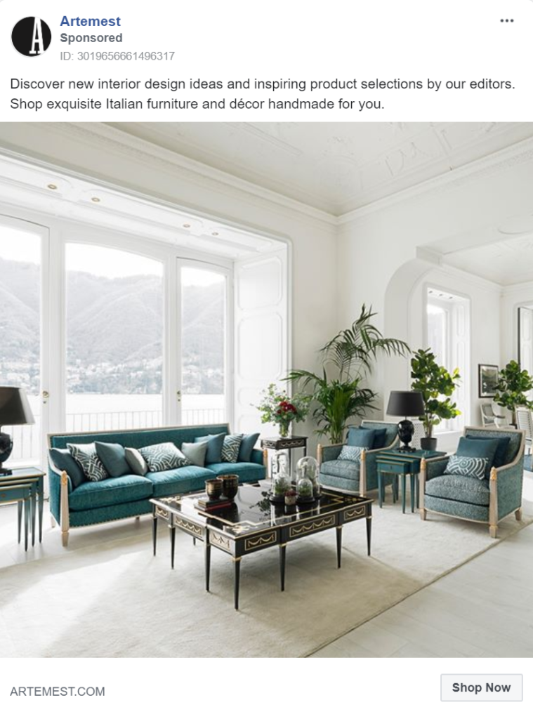
Along with beautiful imagery, Artemest highlights its handmade luxury range in its furniture marketing strategy. By offering unique, handmade pieces their range becomes more desirable and valuable. Their Italian heritage only adds to this feeling.
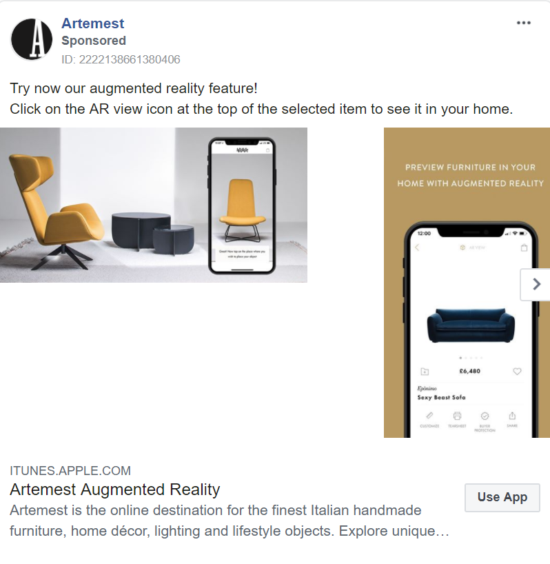
Uncommon among our other brands, Artemest brings the furniture industry into the 21st Century by utilizing tech to drive sales. They’ve invested in an App with augmented reality, allowing potential customers to envisage the products within their homes. With beautiful products, it’s likely that everyone who uses this service will find a piece they love. Seeing is believing and where other ads have urged you to picture living in their rooms, this App brings Artemest’s products into your home.
OKA
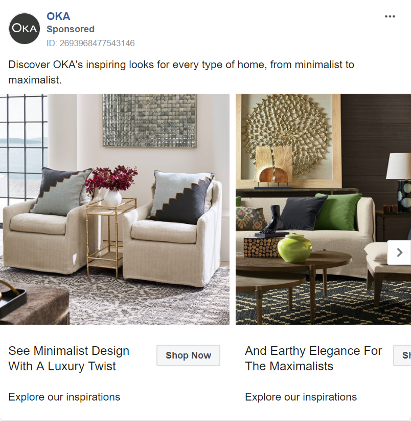
While most brands appeal to a specific taste, often minimalist or maximalist, OKA addresses the difference in style and targets both in its carousel ads. While this is a practical solution to appealing to multiple audiences, it is so much more than that.
By creating two teams, OKA is reinforcing its customer’s commitment to their style. Suggesting that there are only two types of taste leads to people identifying more strongly with “their” style and everything that suites it. It’s likely that this will drive team-specific purchases, or at least tempt customers to visit the website and see what products suite “team minimalist/maximalist”.
Modloft
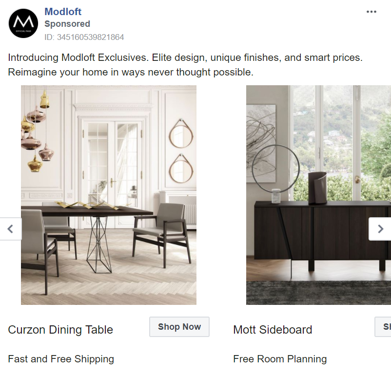
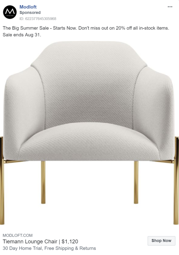
Many luxury furniture brands feel that price is only a small deciding factor for those purchasing their products. As a result, few add classic sales techniques, such as discounts and sales, to their marketing strategies. In reality, almost everyone is swayed by a bargain, no matter their wealth. Simple sales, value addons (like free room planning) and time-sensitive offers (like those in Modloft’s ads) can go a long way in compelling customers to complete a sale.
Conclusion
From the examples above, it’s clear which elements of successful luxury furniture brands’ marketing strategies you should add to your own. Whether you’re a medium, high-end, luxury or vintage furniture brand, take lessons from the experts:
- Don’t just sell your product. Sell the lifestyle it represents.
- Use anything at your disposal to catch your audience’s attention.
- Target your audience’s style. Are they minimalists or maximalists? Do they care more about their house looking homely or fashionable? Ensure that every element of your ad reflects this.
- Encourage brand loyalty by using your messaging to display your brand’s personality.
- Utilize technology to bring your products to life.
- Don’t forget classic sales techniques. They apply to your business too!
For more information on furniture marketing, or for help with your furniture brand’s marketing strategy get in touch with our team.






Leave a Reply
You must be logged in to post a comment.